How do you know when it is time to redesign your website?
I got a call from a client, Mary, a couple of weeks ago.
Mary had some questions about her website and wanted to discuss them with me.
During our conversation, she asked me if she should think about redesigning her website.
(Note: This client’s website is over 5 years old and it is seriously overdue for a redesign).
I told her that yes, it was time to overhaul her website and that she should do it as soon as possible.
Problems With Mary’s Website
Her website had 4 problems:
Outdated Design
Mary’s website dated was launched in 2011. At that time, fixed-width layouts with limited scrolling and smaller fonts were popular. Bright colors weren’t used much and bold visual elements were sparse.
Remember, design trends are different today. If visitors don’t like what they see, they will leave. So it is important to keep the design of your website current.
Old Content
Mary had not added any fresh material to her website for the last several years. And she had also never updated existing content. Since she did not maintain a blog, there was no need for her to do any updates.
Don’t underestimate your visitors. They will figure out that the content on your website is old and that will affect how they think about you. Add fresh content regularly and update old content as it becomes outdated.
The website was not Mobile-Friendly
Mary’s website was not mobile device friendly. When we pulled up her website on a smartphone, it shrank down to fit the small screen. It was difficult to move around and find information.
Non-mobile friendly websites turn away visitors and also affect search engine rank negatively. A responsive website is generally the best bet for most people.
Here is an example of a website that is not mobile-friendly:
Old Technology
First, the website was built using a much older version of Microsoft .Net that is no longer supported. Because of this, her website did not function properly in all browsers.
(Note: As of April 2016, Microsoft has advised users to upgrade to later versions of Microsoft.Net).
Second, the website used Adobe Flash for visual elements. Flash is outdated and has many security problems & needs ongoing updates. It also does not work on apple mobile devices. Adobe Flash should be replaced as soon as possible.
Third, older technology development and hosting platforms come with their own inherent security risks. These hosting and development platforms should be updated and upgraded to minimize security
Given that this website was over 5 years old, it was important to redevelop it using newer technology. It was also important to use updated & upgraded hosting.
Client Pushback
The client did not agree with me. She gave me 3 reasons why she was not prepared to overhaul her website:
I Don’t Need a New Website
She felt that the current website was adequate and that she really did NOT need a new website. While she agreed that the design was dated, she also said that it wasn’t “that bad“! Even the functional issues did not deter her.
This the most common reason we get. A lot of people do not understand the importance of keeping their websites current.
I Don’t Have the Time
My client said she would not have the time to manage a redesign project. She would probably have to hire someone to handle the project and that would add to the cost. On top of that, she claimed she was very busy and she felt that she would not be able to do justice to the project.
Is your website is important to you and to your business? If so, find a way to make the necessary time to keep it current.
It Doesn’t Generate Business for Me
She said that her website was just an online “brochure” and that it did not generate any business for her.
Her website was dated, had functional problems and had not been updated in several years. And it was not mobile friendly. No surprise that it was not generating many leads.
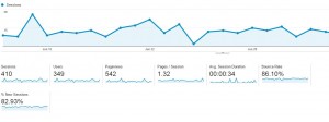
We looked at her visitor stats and saw a high bounce rate. Had she been paying attention to the statistics, she may have caught on earlier. An old website is not the only cause of a high bounce rate but a dated design WILL impact how visitors behave. So, unless you track and analyze visitor activity on you website, you won’t have any insight.
Here is what a high bounce rate looks like in Google Analytics:
Cost
Cost was not a factor in this case. Unlike most small and medium businesses, she had actually established a formal marketing budget. If necessary, she could allocate these funds to redesign project. So cost was not a major issue.
For this client, the lack of need overrode everything else. And that is the case with a lot of people.
Asset or Liability?
A rather large number of people think of their website as a liability rather than as an asset. They are reluctant to invest money in maintaining, upkeeping and especially in getting a new site. They tend to believe that once they have a website, it is good enough for a long time.
I am not sure where this mindset comes from but I believe this to be a lack of education and awareness.
Today, you cannot operate a business without a well designed and maintained website!
 Impact of an Outdated Website
Does an outdated website translate into a poor business?
Many studies show how people react to websites. They either like them or dislike them. And these reactions can be pretty strong!
You have about 4 seconds to capture the interest of a visitor. If they don’t like what they see, they leave.
Do you want your potential customers to leave?
Your website is almost always a customer’s first impression of your brand or organization. If it looks outdated, or the content is not fresh, or it is broken, don’t be surprised if you get a negative reaction.
More than anything else, an outdated website shows a lack of attention to your business. Think about the message that sends to potential customers.
Here is what the Arnima Design website looked like before it was redesigned:
And this is what it looks like now (after a full overhaul):
If you are running a physical (brick and mortar) store, would you not update the decor? Keep your lighting, product displays and area clean and fresh? Would you not renovate your store on a regular basis?
Say you were to go to the mall to buy a nice shirt. You walk through the mall and come across a store selling shirts. The storefront is old, lighting is dim, the decor looks dated. Shirts are not properly displayed and there is dust everywhere.
Now, across the way, you see another store. This one looks bright, clean, with even lighting, and is well-decorated. Shirts are nicely laid out. It looks nice and fresh
Which store would you tend to gravitate towards?
Such is the case with your website. Think of your website just like a physical store. When people land on your website and see a dated, tired old design, they will go elsewhere.
If your website is old, you may lose business even if your company provides superior products and services. And even more so if your competitors have modern, nicer, and regularly updated websites.
Perceptions Of Outdated Website
Here are a few perceptions caused by outdated websites that can damage credibility:
Are they going out of business?
No updated news? No new blog posts? An outdated website will make people wonder if you are closing shop.
Will their customer service be poor?
Outdated content can contain incorrect phone numbers. Or old email addresses. Your contact form may not work. These red flags can turn off prospective customers.
Are they technically incompetent?
This one is self-explanatory. If your website is old, it forms an impression that can be difficult to overcome.
They have no pride in their company!
Again, this one is self-explanatory. A website is an extension of your organization. An outdated website sends a message of apathy. Apathy turns prospective customers away.
Stereotypes
There a few “stereotypes” when it comes to dealing with website redesign.
It’s Working Fine
We get this one all the time. Many people are satisfied with their websites. They have no interest in pursuing a redesign unless it is absolutely essential. They don’t understand the need for a new site. If that is you, read on to learn more.
I Think It Looks Good!
While you may be OK with a 2000’s look, trust me when I say this, your potential customers will not! Perceptions matter. People make a lot of decisions based on look and feel. Otherwise, the advertising industry would be putting out really dreadful stuff. And you and I would be perfectly OK with this drudgery!
I Just Don’t Have Time
Are you serious about your business? Are you vested in your work? If yes, then I have only one thing to say here. Make the time.
I Don’t Get too Many Visitors
Maybe the reason you don’t get too many visitors is your outdated website! Or that your website is not mobile device friendly.
Do you know what your website visitors are doing when they land on your site? Do they stick around or do they bounce off?
Track and monitor website visitor activity. Figure out what they are doing. And use that data to improve your website. Redesign it. Optimize it.
I Can’t Afford It
An understandable point for a lot of small and medium businesses. Do you have a budget for rent? Payroll? Supplies? Internet? Sure you do. Create a marketing budget. Earmark and set aside funds on a monthly or annual basis. Use these funds to manage, maintain, update and redesign your website. Roll these funds over every 2-3 years.
Do you want to neglect what is probably your most important marketing asset online?
When Should you Redesign Your Website?

As a general rule of thumb, redesign your website every two to two-and-a-half years. If you must push it, then no more than every three years.
You always have the option of incremental updates every few months. This way, you don’t have to go through the pain of a full overhaul.
Whatever you do, overhaul your website periodically.
Other Factors to Consider
Here are a few other factors to consider:
Age
If your website is more than 3 years old, it is time to redesign your website.
Dated Design
Website design trends are continually evolving. If your website looks like it came from the 1990s it will send a certain message to your customer base.
- The design is unappealing
- You are using color schemes that were popular 10 years ago
- Missing call to action items
Old Content
If your website contains really old and dated content, it is time to overhaul it. Here are a few things to get rid of, or, better yet, rewrite and repurpose:
- Old blog posts
- Old news articles
- Outdated contact details
- Stale web page verbiage
Mobile Friendliness
- Shrinks down to fit smaller screens
- Gets cut off on smaller screens
- Requires excessive zooming and pinching to navigate
Difficult Navigation
- The navigation structure is difficult to follow
- Menu options are not clear
- Information is difficult to find
- Navigation is broken
Your Competition is Years Ahead
- Your competitor’s websites are much newer and nicer
Branding
- An old or outdated logo
- Does not align with current brand
Performance
- Slow website performance
- Large, un-optimized images
- Takes a long time to load
Outdated Technology
- Old server hardware
- Insecure plugins or patches
- Old technology (ASP, Cold Fusion, Older versions of PHP etc)
- Old Multimedia (Adobe Flash, Shockwave etc)
Embarrassment
- You are embarrassed to share your website URL because it is outdated.
What does Redesign Involve?
Take the following items into consideration as you go through the website redesign process:
Look & Feel
- Wider widths, larger fonts and longer pages.
- Use of multimedia and visual elements that stand out.
Mobile-Friendliness
Currently, mobile device users currently make up over 50% of your total user base. Here is an article that discusses the importance of having a mobile-friendly wesbite. Mobile-friendly websites reduce bounce rate and get more traffic. These are preferred by mobile device users.
- Use responsive design
- Add click to call features
- Use well-defined tap targets
Search Engine Rank
To avoid an SEO disaster, you may want to consult a digital marketing specialist before you start the redesign project.
Be sure to:
- Keep the URLs as similar as possible
- Redirect any removed or replaced pages
- Keep historical content and links
Here is a great article from moz.com that will help avoid an SEO disaster when going thru a redesign.
Call to Action
- Include a relevant call to actions
- Forms
- Banners
- Buttons
- Click to call features where visitors can simply click or tap your phone number to place a call.
Content
Content has the biggest impact on your search engine rank. The more quality content you add to your website and the more current you keep it current, the better your rank!
- Add fresh content regularly
- Write blog posts
- Add news & press releases
- Add articles
- Add multimedia content such as images, drawings, videos & infographics
Performance
Today’s users are a rather sophisticated lot and expect websites to load rapidly.
- Load times of less than 4 seconds
- Optimized images
- Optimized videos
- Improved navigation
- Mobile friendly menu system
- Content should be easy to find
Readability
- Larger fonts
- Proper use of white space
- Easy scrolling
Technology
- Use established development platforms
- Use reliable and safe hosting
- Setup uptime monitoring
- Regularly update & upgrade your software
Many web hosts automatically update their technology platforms to the latest versions. These types of automatic upgrades can cause older websites to “break” due to incompatibilities. Keep your webiste current to avoid such problems.
Are you ready to redesign your website?
What kinds of issues have you dealt with when it comes to overhauling your website?


